UKY

Website Redesign

The original website felt unstructured and difficult to navigate. Key information wasn’t clearly prioritized, spacing lacked consistency, and the overall design felt outdated compared to modern UI expectations.

KeepSake

Overview

This project marked my first deep exploration into UI/UX fundamentals. Working collaboratively within a team, we redesigned an existing website to improve usability, visual hierarchy, and overall user flow. The project emphasized structured design thinking and system-based execution using Figma.

User Flows

WireFrames

Account Section

Protoype

Account Section

Problem

The original website lacked clarity and organization. Important information wasn’t easy to find, the layout felt inconsistent, and the overall design didn’t reflect a clean, modern user experience.

Goals

Improve usability and navigation clarity

Establish Strong
Visual Hierarchy

Apply foundational UI/UX principles

Collaborate effectively within a team workflow

Process

1. Research & Analysis

We evaluated the existing interface, identifying pain points in structure, readability, and interaction flow. Competitive analysis helped us understand industry standards and user expectations.
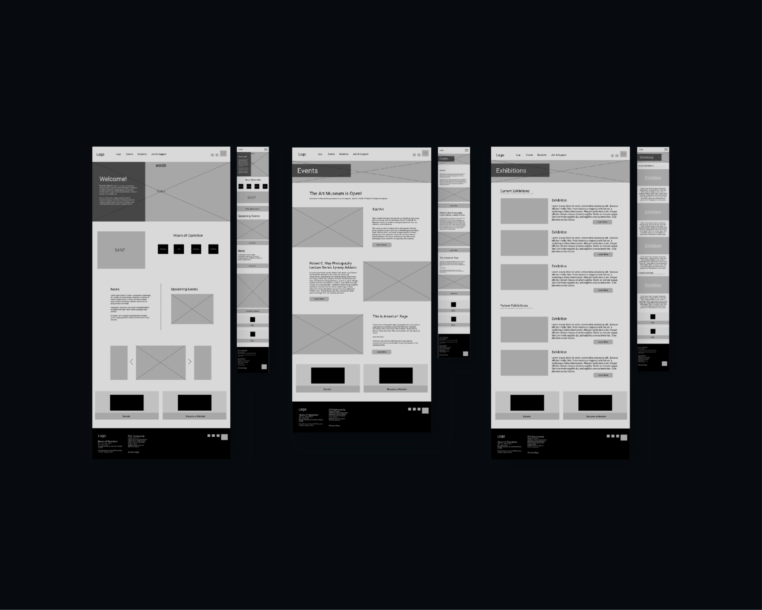
2. Wireframing

Low-fidelity wireframes were created to restructure layout and prioritize content. This stage focused strictly on functionality and flow before visual styling.

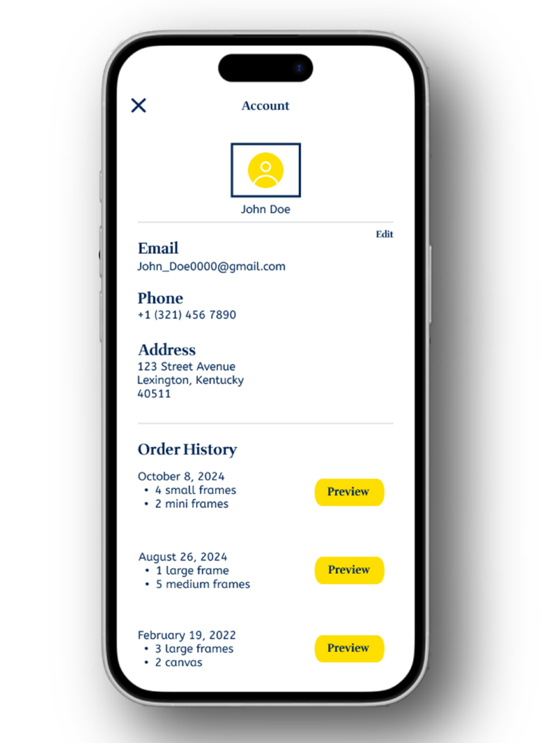
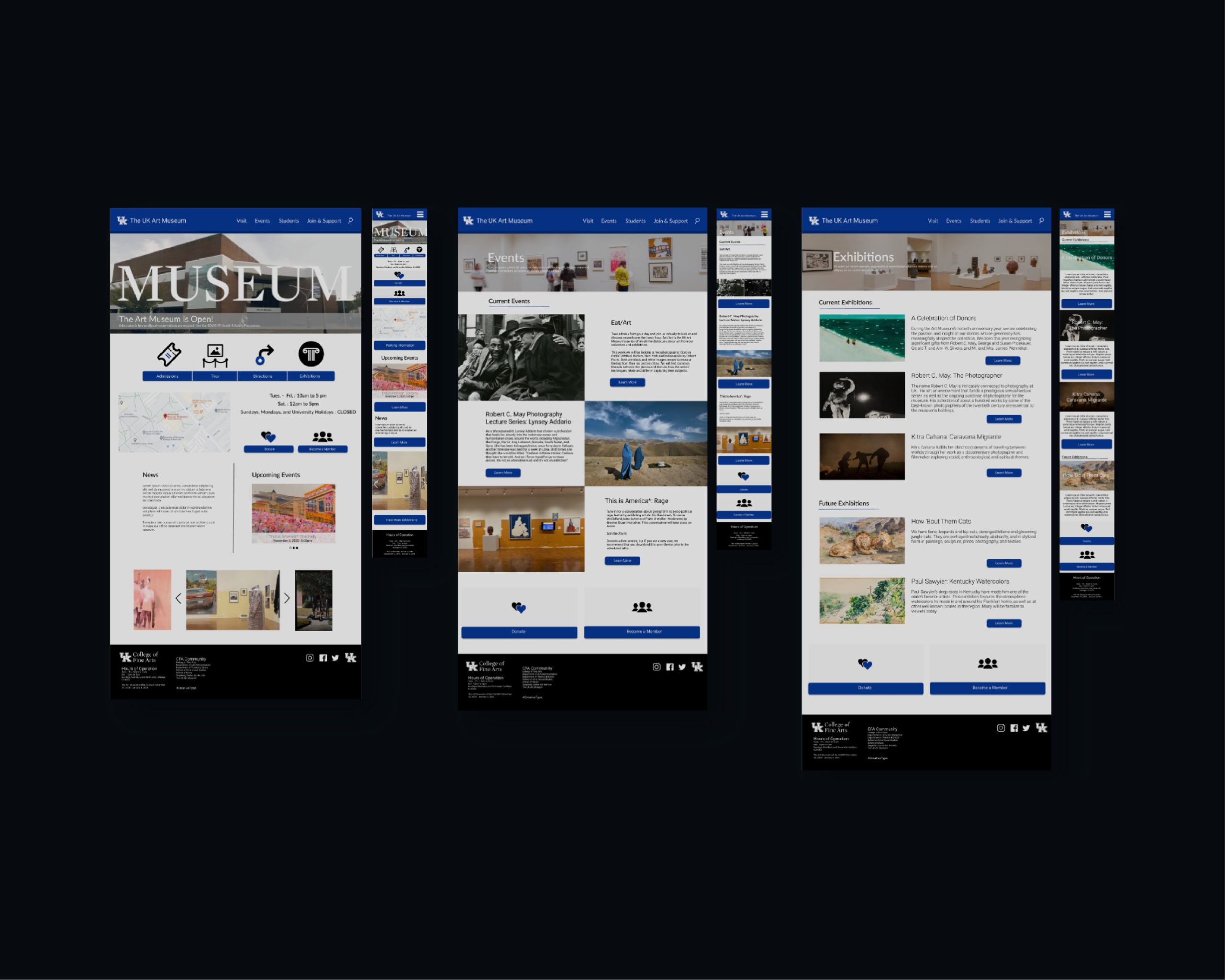
3. High-Fidelity Design 

Using Figma, we developed a refined UI system including:

  • Defined typography hierarchy

  • Grid-based layout structure

  • Consistent spacing rules

  • Button and component states

  • Cohesive color usage

Figma allowed for real-time collaboration, streamlined feedback, and component-based scalability.

Team Collaboration

This was a team-driven project where roles were divided across research, layout structuring, and UI refinement. Regular design critiques improved iteration quality and reinforced structured design decisions rather than aesthetic guesswork.

Key Learnings

  • Importance of user flow mapping before visual design

  • Grid systems as the backbone of clean UI

  • Designing with consistency over decoration

  • Collaborative workflows using shared Figma components

  • Translating UX principles into scalable UI systems

Outcome

The redesigned website presented clearer navigation, improved readability, and a more modern interface aligned with usability best practices. The project laid the foundation for a structured understanding of UI/UX design and system-based thinking.

View full Prototype