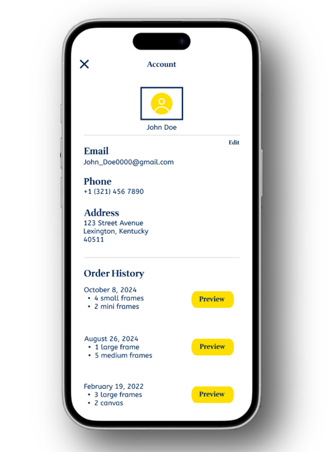
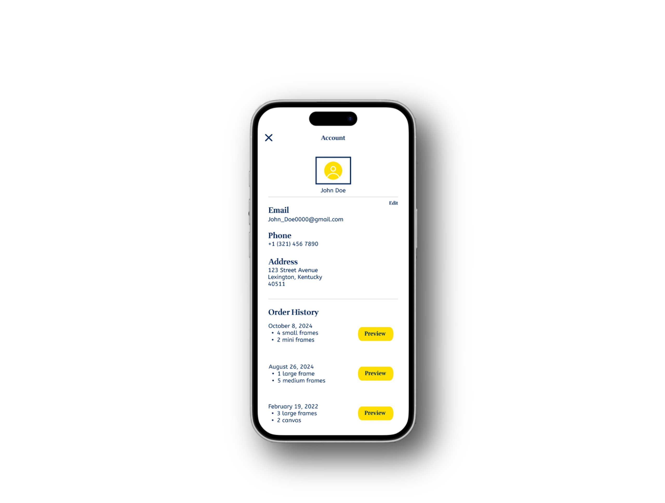
KeepSake

App UI/UX Feature Expansion Case Study

Enhancing User Personalization & Retention

KeepSake

Overview

This project focused on expanding the KeepSake mobile app to improve user personalization and long-term retention. The objective was to introduce new engagement-driven features while strictly adhering to the app’s existing UI system and design language.

Account Section

Rewards Section

Account Section

Problem

The original app lacked a centralized account experience and did not provide strong incentives for users to return after purchase. There was limited visibility into user information, order history, and no built-in retention mechanism.

Goal

Improve
Personalization

Increase
User Retention

Maintain Alignment
with Existing UI System

Avoid Disrupting
Visual Consistency

Research & Strategy

I analyzed common retention patterns in e-commerce and lifestyle apps, identifying two high-impact opportunities:

  1. Clear account management access

  2. A structured rewards system to drive repeat engagement

The solution needed to feel native to the product — not like an added feature.

Solution

1. Account Section

I designed a dedicated account interface that allows users to:

  • View and edit personal information

  • Access purchase history

  • Navigate settings efficiently

The layout followed the existing grid system, typography hierarchy, and component structure to ensure seamless integration.
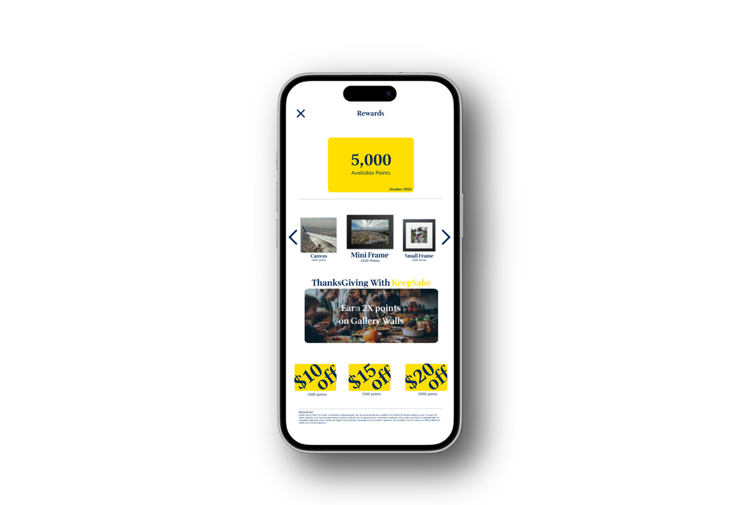
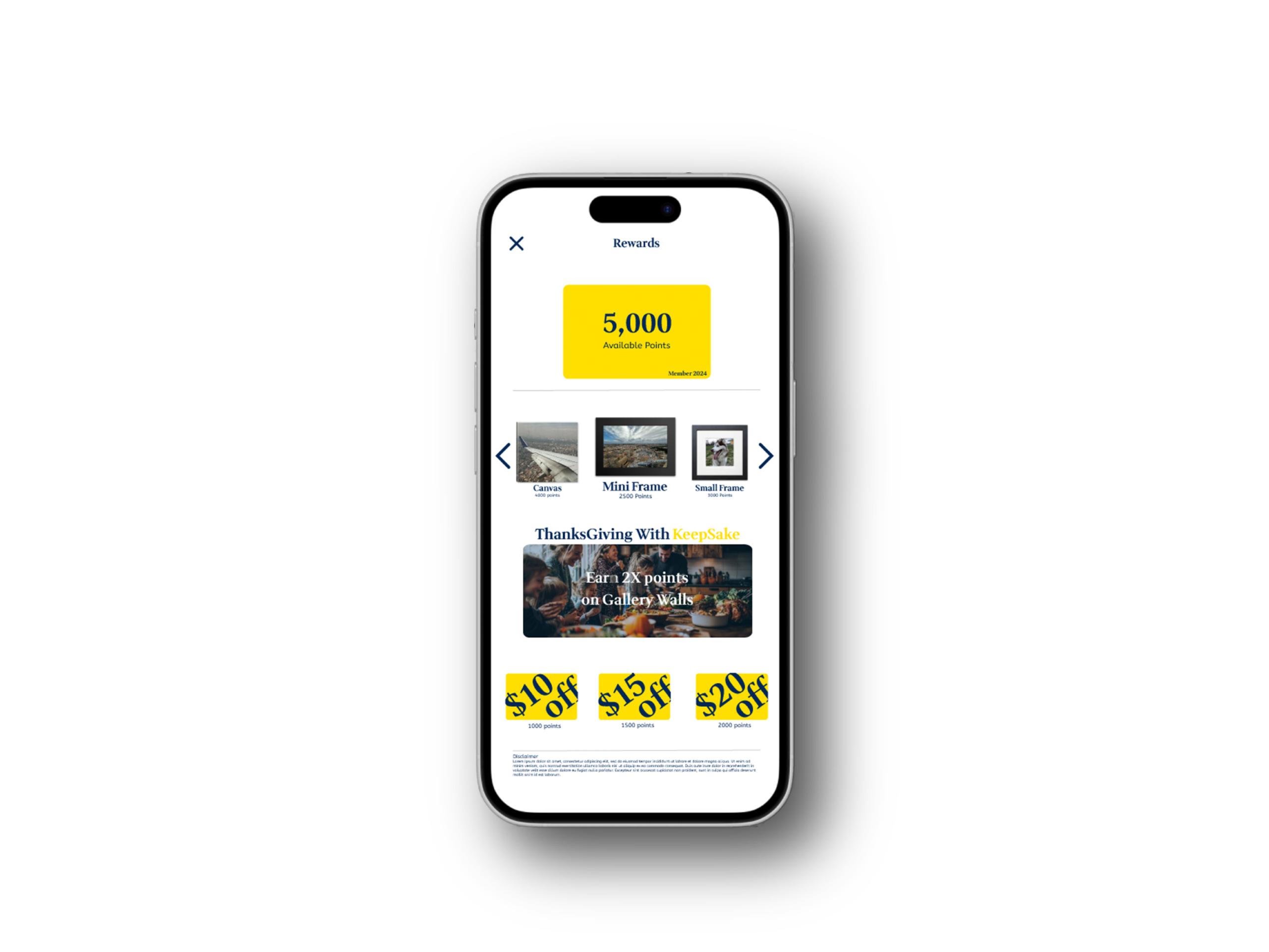
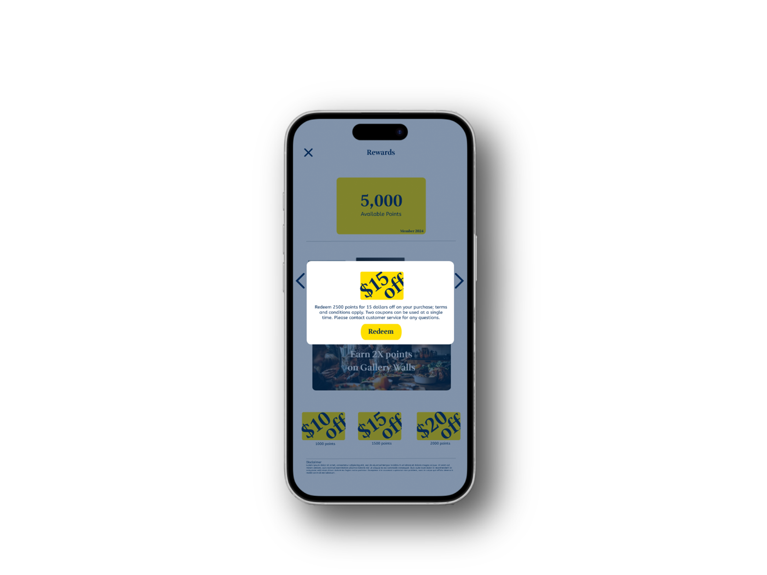
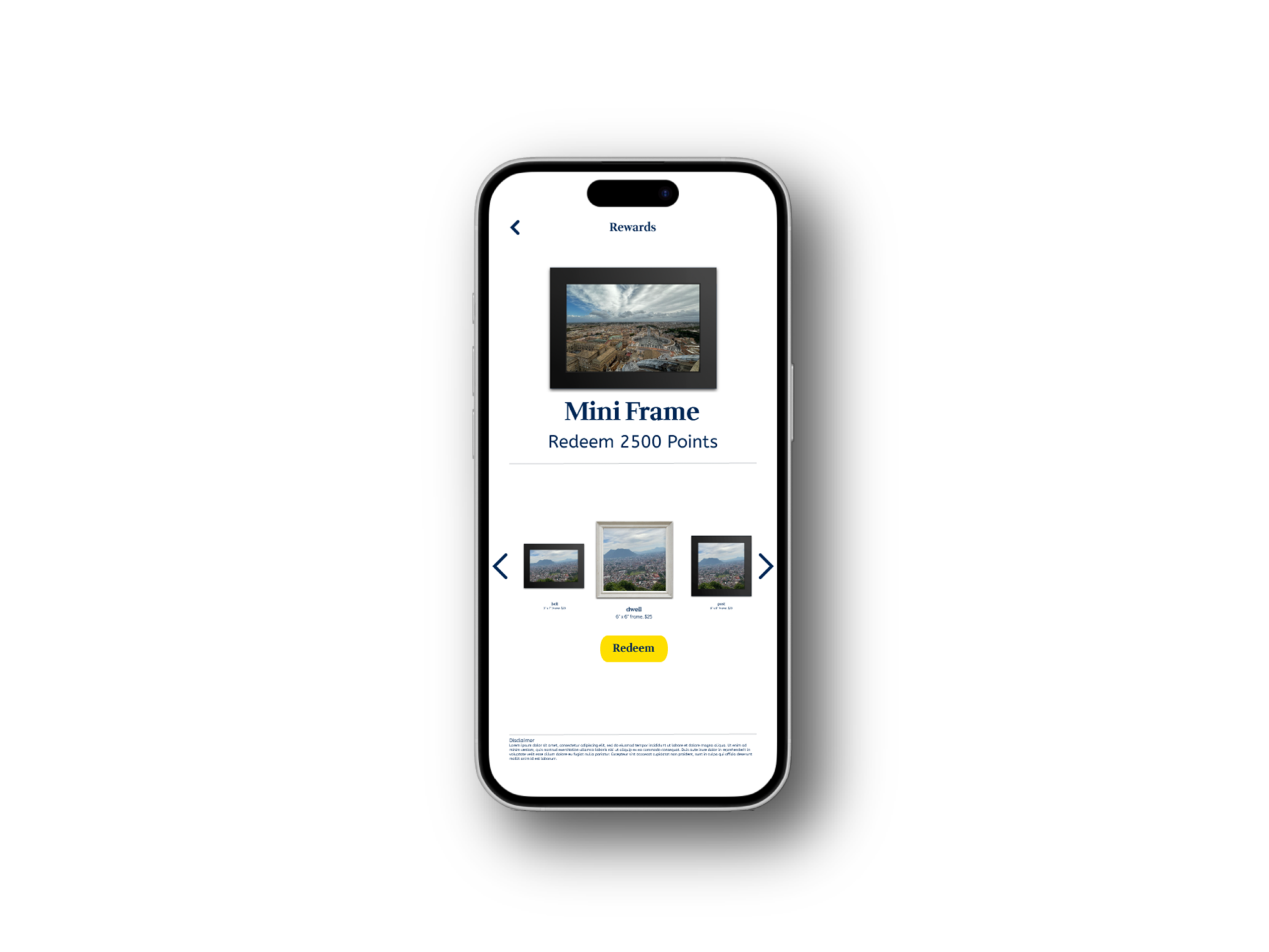
2. Rewards System

To encourage repeat engagement, I implemented a points-based rewards feature.

  • Users earn points through purchases

  • Progress is visually displayed

  • Redemption incentives encourage return visits

The design uses clear hierarchy, simple progress indicators, and consistent UI elements to preserve usability.